PROJECT:
GLOBAL MARKETPLACE
CLIENT:
Brand USA: Global Marketplace
SERVICE:
Branding, Content
TYPE:
Event Branding, Content Creative, Production
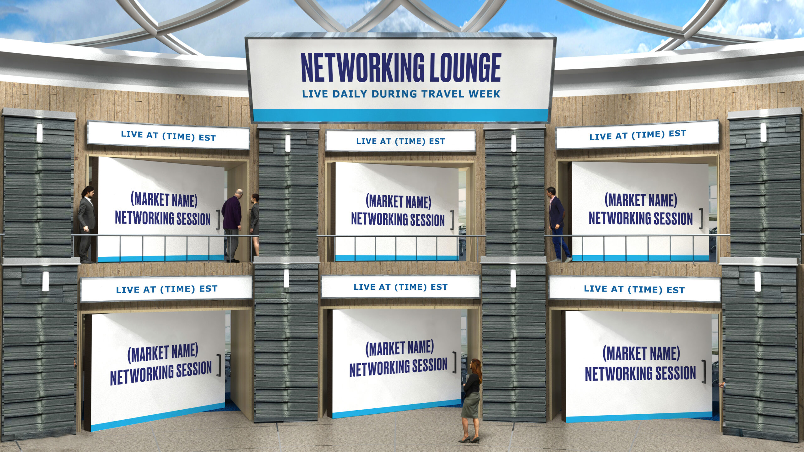
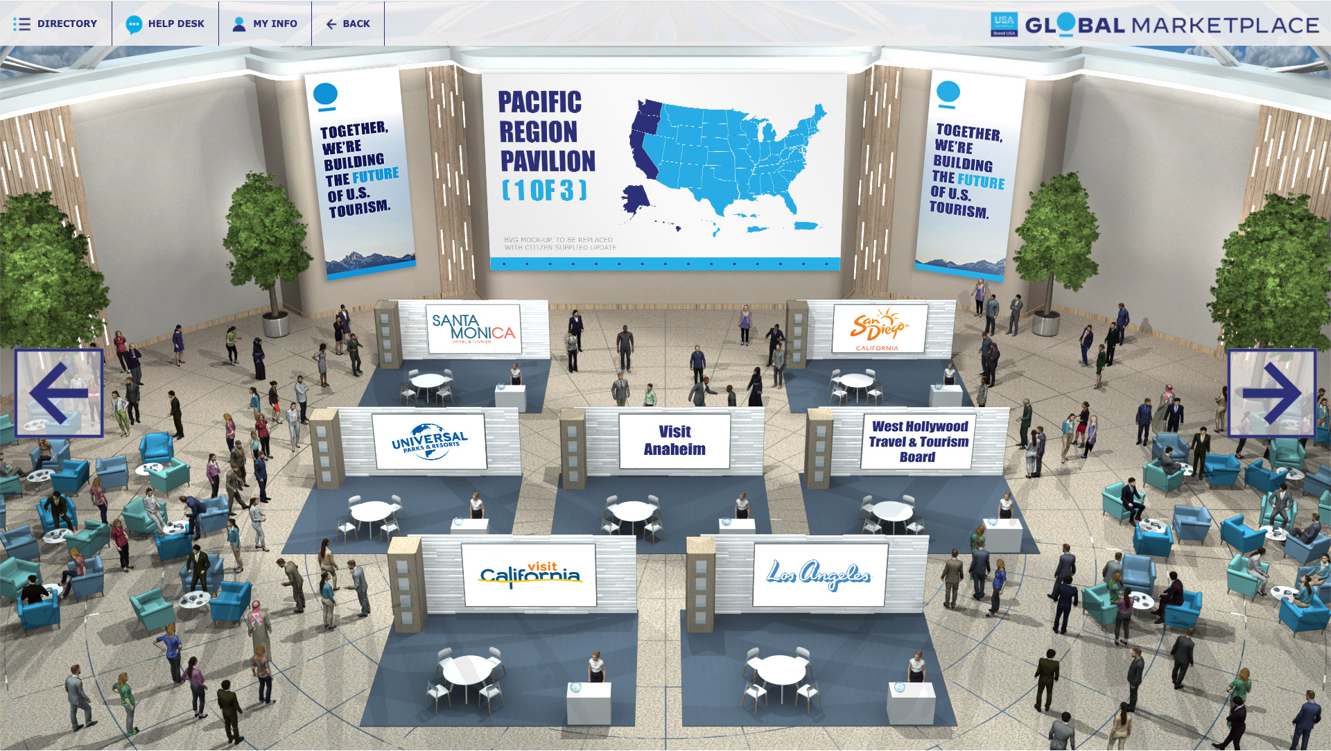
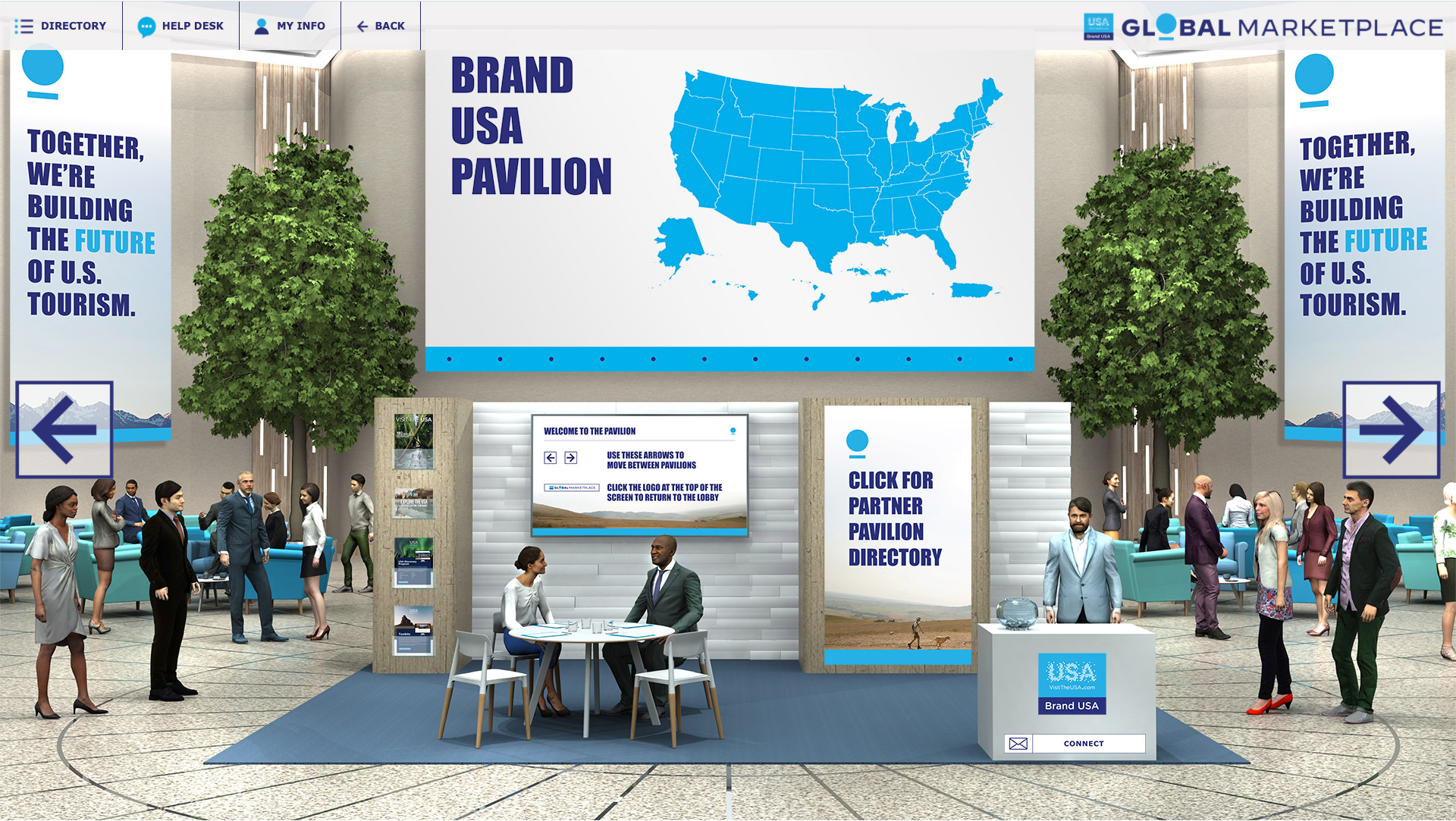
Brand USA drives the conversation in an industry responsible for millions of American jobs. When it became clear that trade conferences during Covid-19 would require a slightly different approach, they set out to create a virtual meeting space where international collaborators could unite and plan a global travel recovery.
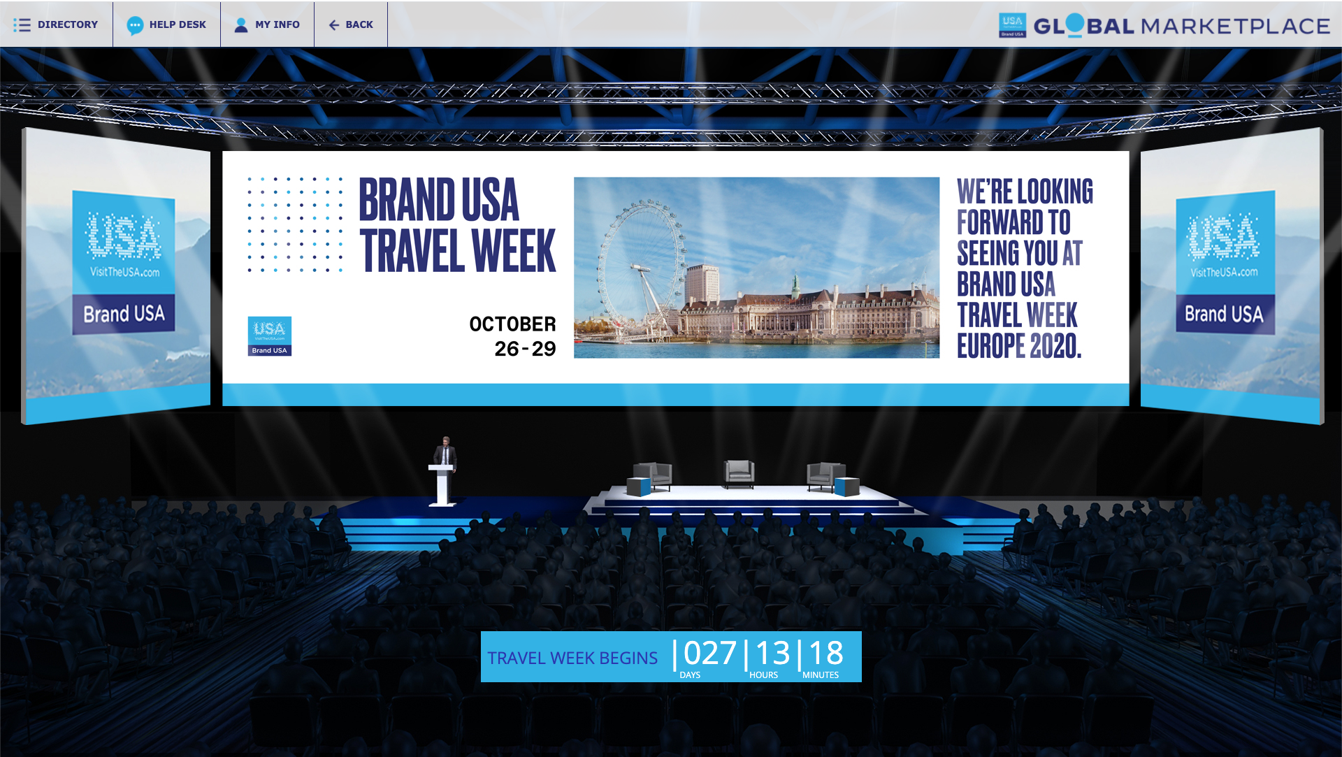
When they came to us in the early days of quarantine, Brand USA had an urgent need: design a virtual space flexible enough to “host” events throughout the year, but close enough to the parent brand to feel recognizable, streamlined and cohesive. We delivered on their branded virtual space, then went a step further and created a remote studio to streamline production of their content and presentations throughout the year.
During an unusually stressful time, we wanted the brand design to lean into an identity that felt like a smooth departure from the noise and forced adaptation happening all around us. (Zoom fatigue is real, guys.) The look and feel for the “venue” had to tie into that of the parent brand, but also feel fresh enough to set the tone for the timely thought leadership that would be represented on the platform. To do this, we leaned into the idea of mindfulness, and set the simple act of breathing as a focal point for our branding within the confines of the existing logo.
Unlike many of the convention centers we’ve had the opportunity to visit, this one would not have a million colors, sounds, and alerts vying for your attention. It would feel calm, focused, and - dare we say - pleasant.
Then, we built programming — 17 hours of it, to be exact. To execute that amount of internationally-filmed content at a high production value, showcasing back-to-back talks and panels from global travel industry leaders, we created a remote production studio complete with branded backgrounds and live supers; just like the news, but far more optimistic!
The project was such a success, Brand USA decided to make the virtual venue a component of future live events to increase participation and decrease barriers to entry for attendees. To that, we can only say, Namaste.
THE LOGO DESIGNS
THE BRAND COLORS

THE TYPE SYSTEM
BRINGING THE MARKETPLACE TO LIFE
THANK YOU
CLIENT
Brand USA
V-MIX TECH
Garrett Guidera
EDITOR
Bethany Matus
EDITOR
Otto Mertins
V-MIX TECH & EDITOR
John Dean
We’re always excited to meet new collaborators and potential clients!
Have something in mind?

NEWSLETTER
We love a good story. Sign up here to get a few in your inbox from time to time.
