CASE STUDY
INDUSTRY:
HOSPITALITY / BAR
PLACE:
A FORMERLY ABANDONED BAR
IN THE HEART OF DETROIT
SERVICES:
BRAND IDENTITY, PACKAGING, INTERIOR DESIGN, PRODUCT DESIGN, WEB, SOCIAL, CONTENT
THE CHALLENGE
Place Making,
By Design
On a dark corner of NW Detroit stood a boarded-up bar where neighbors once came together to celebrate, mourn, debate, fall in love, and meet new and familiar faces alike. We worked with the new owners to bring that community hub back to life, designing a brand and a space that felt welcoming but intimate, and timeless yet modern.
Sometimes you wanna go where everybody knows your name and they're always glad you came. You wanna be where you can see our troubles are all the same.You wanna be where everybody knows your name.
― Cheers
RETAIL DESIGN
The Bar
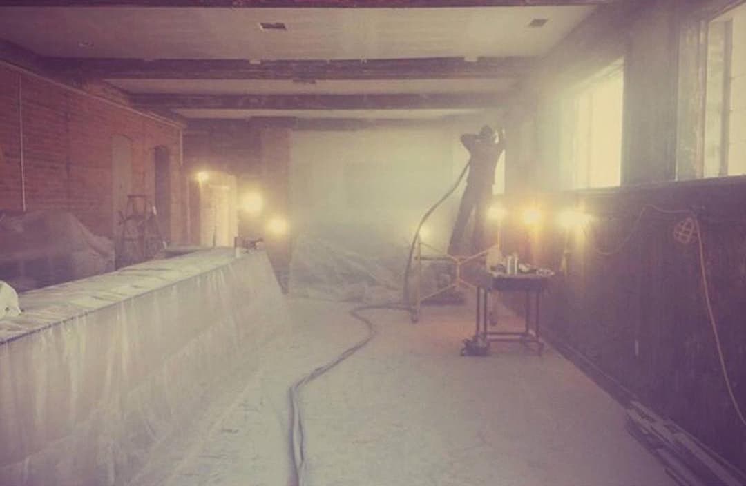
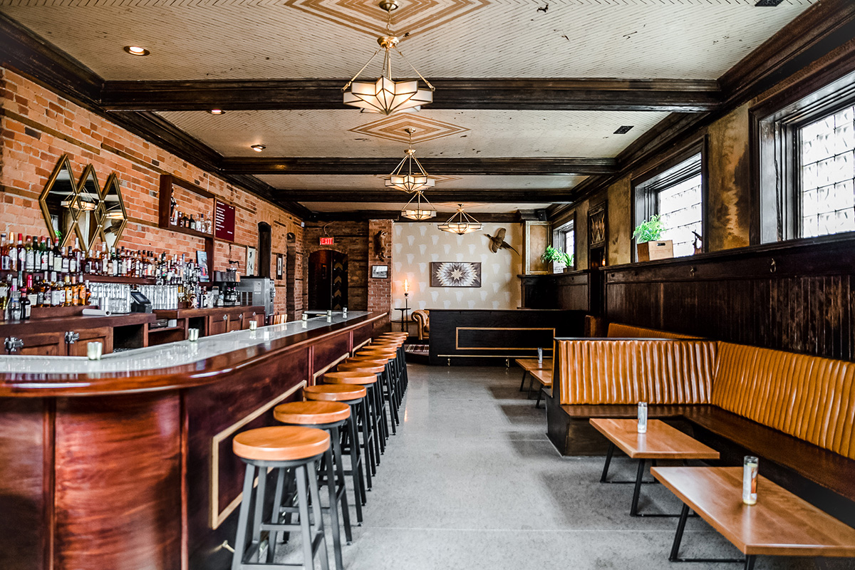
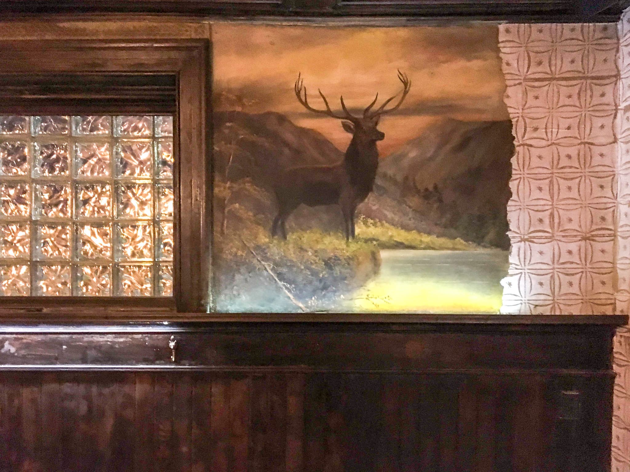
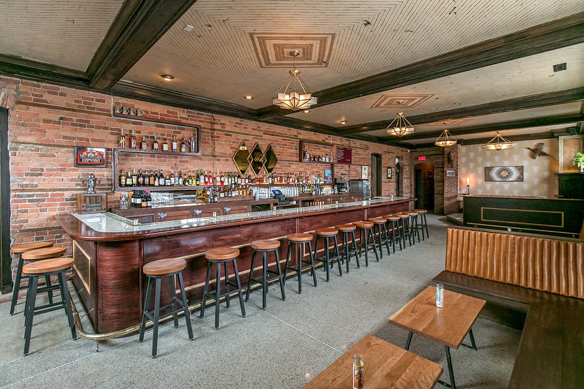
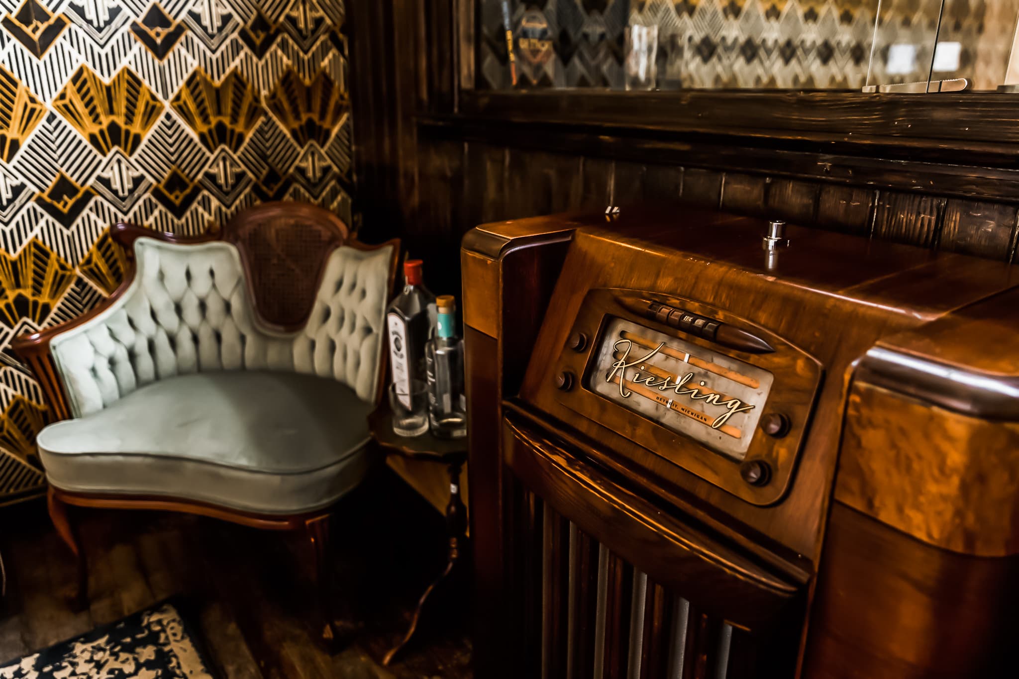
Initially a white box, we sought to bring back the historic charm of the original watering hole, with timelessly modern elements that would make today’s neighborhood residents and visitors feel right at home. After scraping through layers of old paint, we couldn’t believe our luck in uncovering a 4-season mural from 1913 depicting a forest scene. The developer sourced the antique bar back and brass foot rail from another closed local establishment, and we got to work sourcing wall, ceiling and furniture treatments that would speak to the creative direction of the space.
Creating Spaces
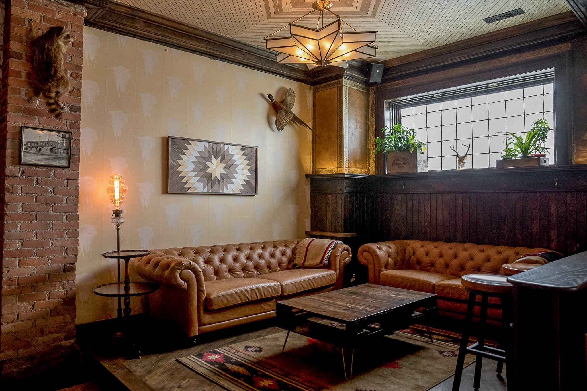
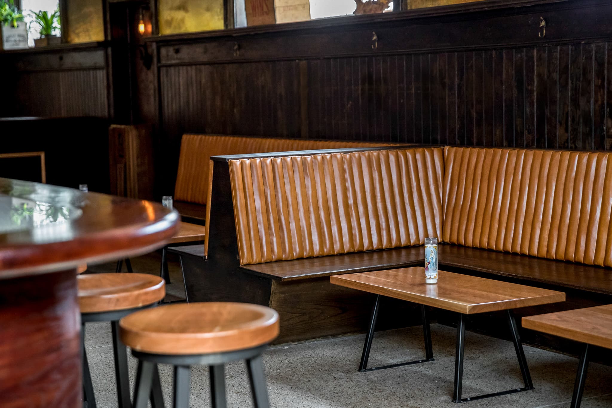
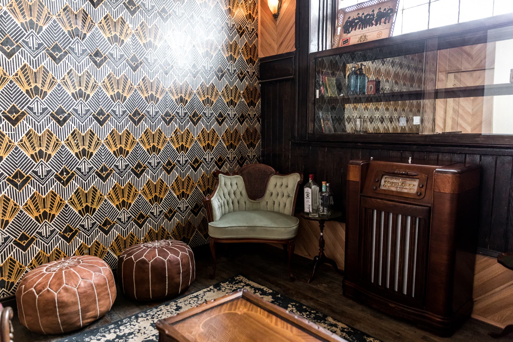
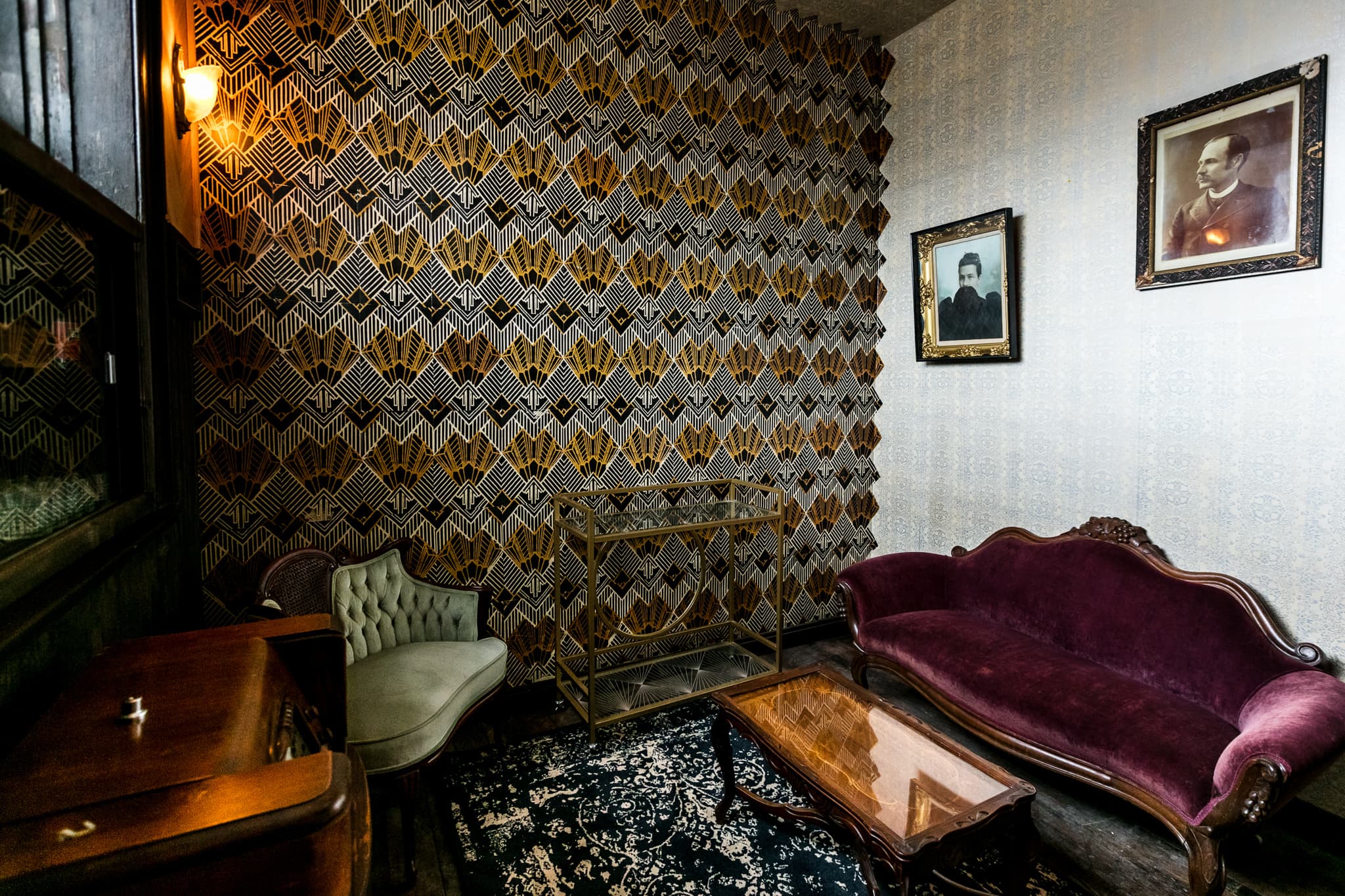
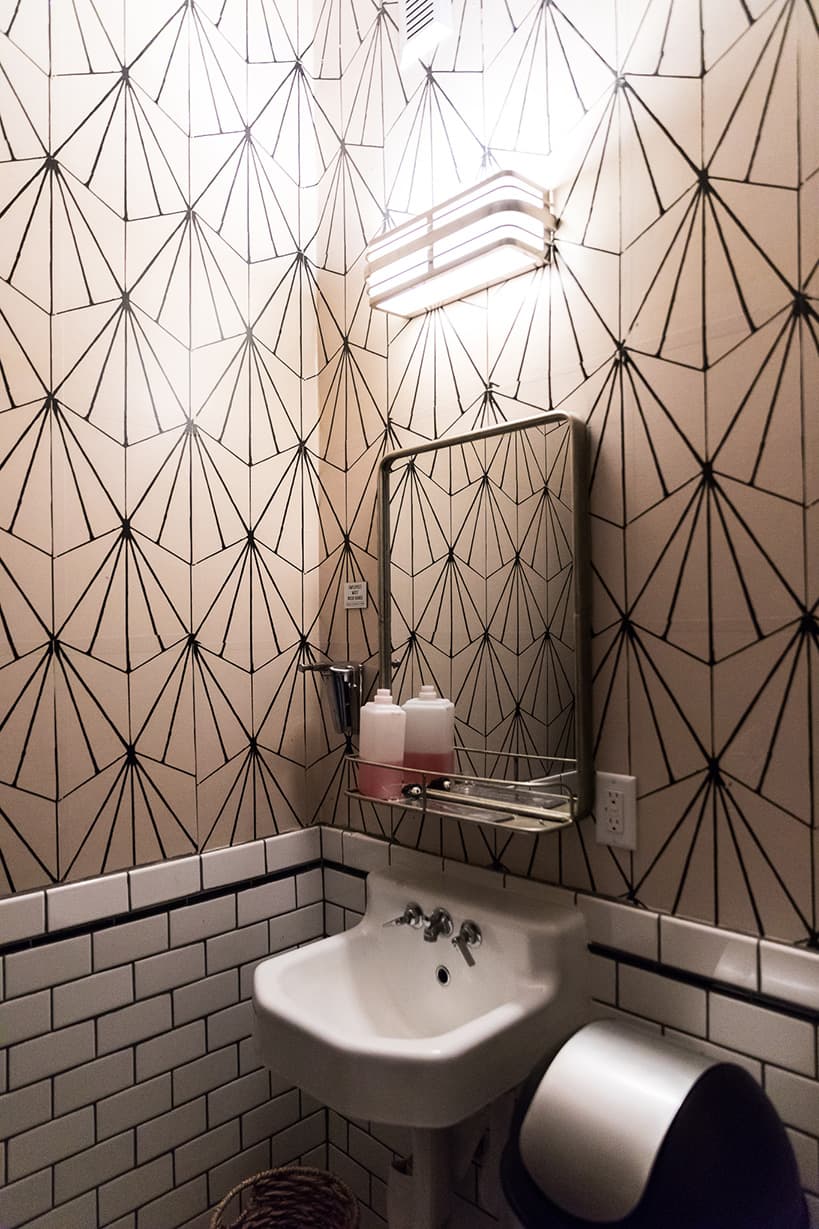
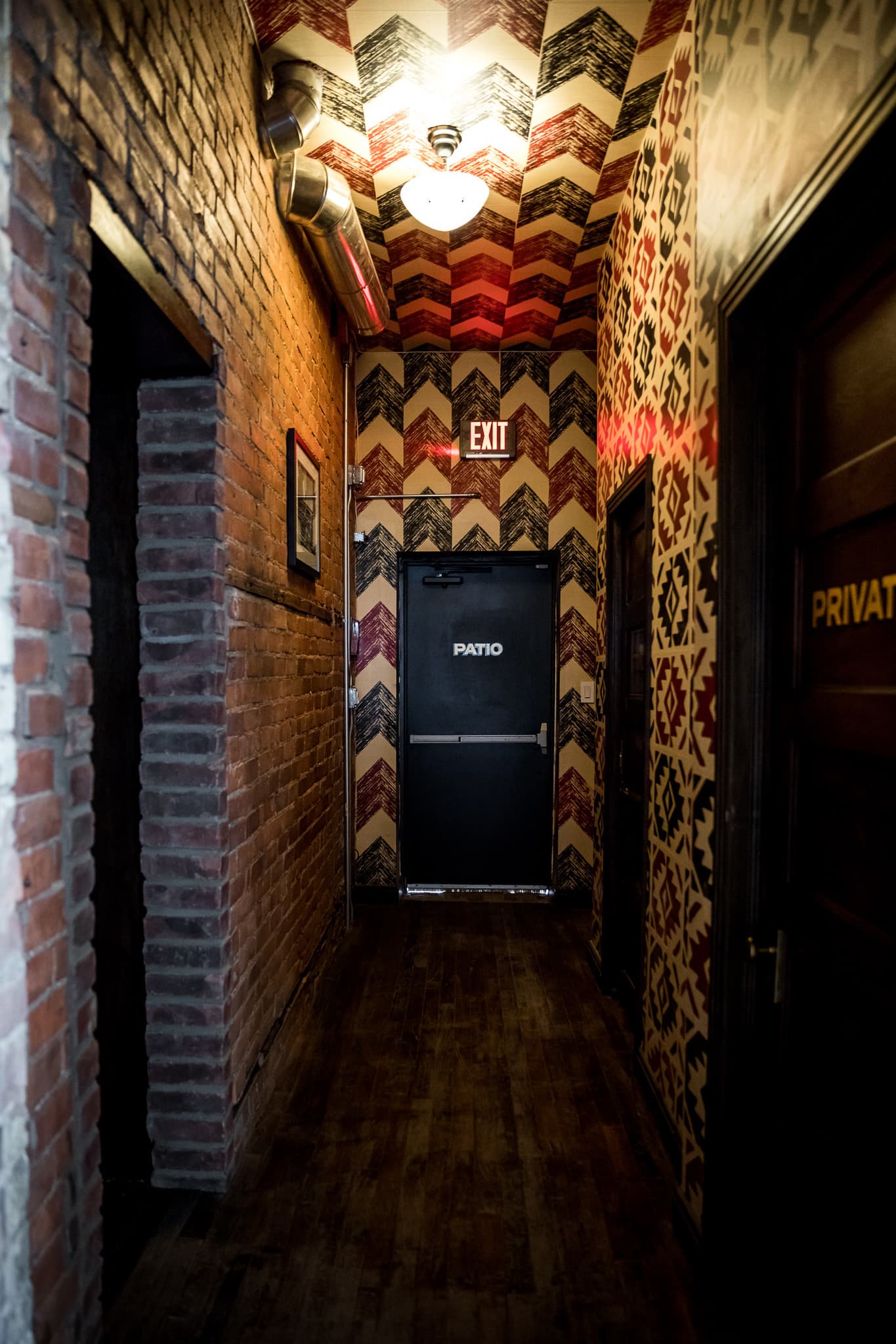
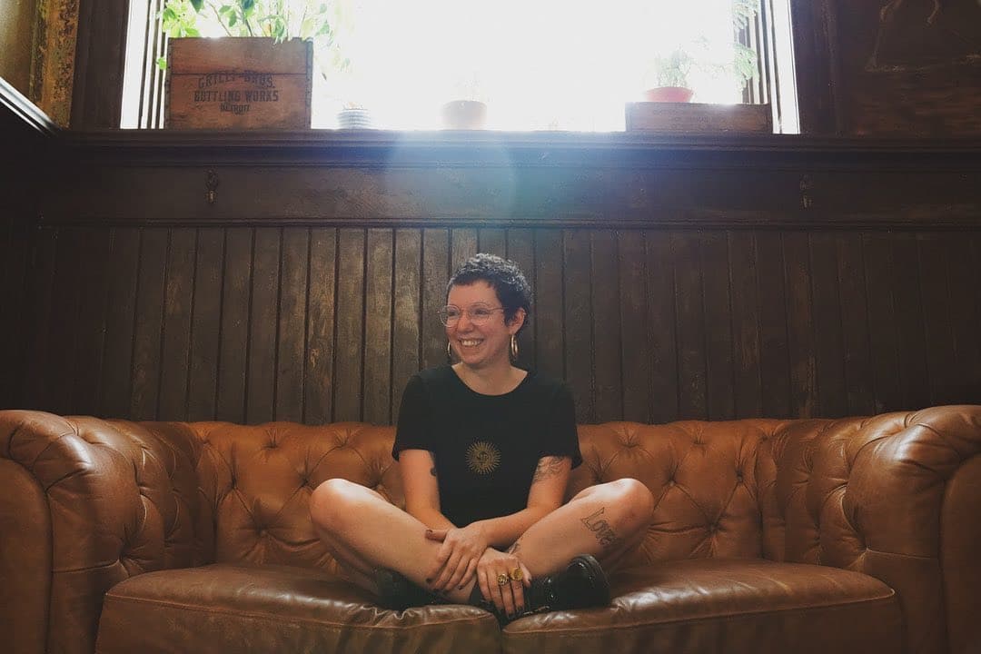
To create unique niches within the larger space, we complimented the murals with warm and inviting surface materials and a diverse range of hand-pasted wallpaper panels. We intended for each customer area to stand apart from the rest, but be united in a common vision. The upside to this approach is that there are many unique areas to photograph within the bar. This comes in handy for staging cocktail shots to support merchandise promotions, but it also encourages patrons to find their favorite spot to take a selfie, helping to get the word out about the bar in the process!
The Details
Bringing in native plants, animals (in the form of taxidermy), photographs and paintings representing the neighborhood's history (and impressive residents), and maps depicting the neighborhood's evolution, we were able to accentuate each wildly wallpapered surface into an engaging world of its own.
We went further to cut and wrap the wallpaper surfaces around the walls to create a "cocoon" feeling in some of the more intimate spaces.
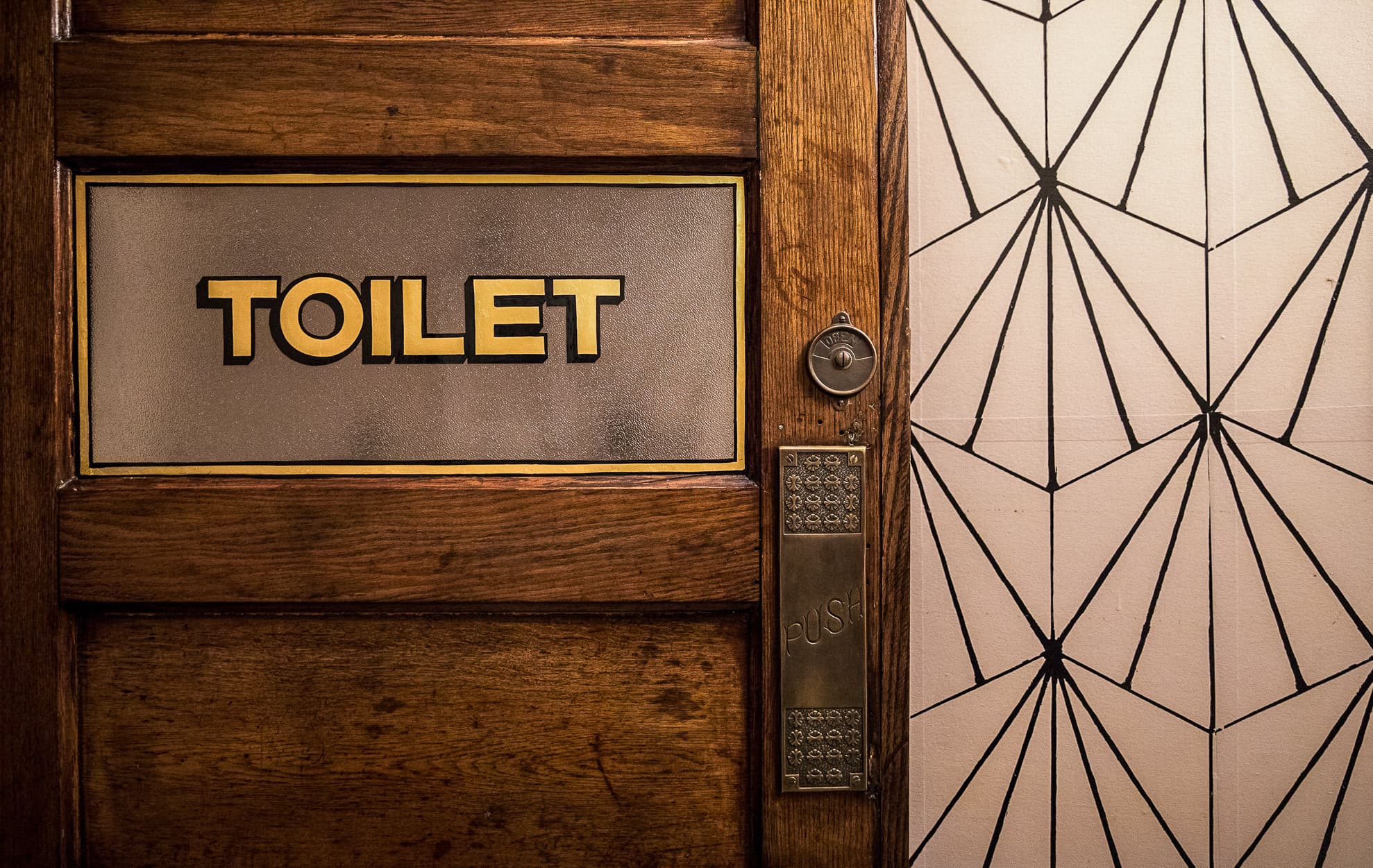
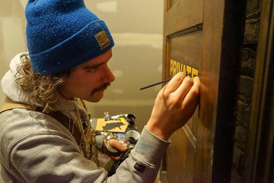
All signage was hand-lettered using the traditional gold leaf technique.
No surface was left untreated.
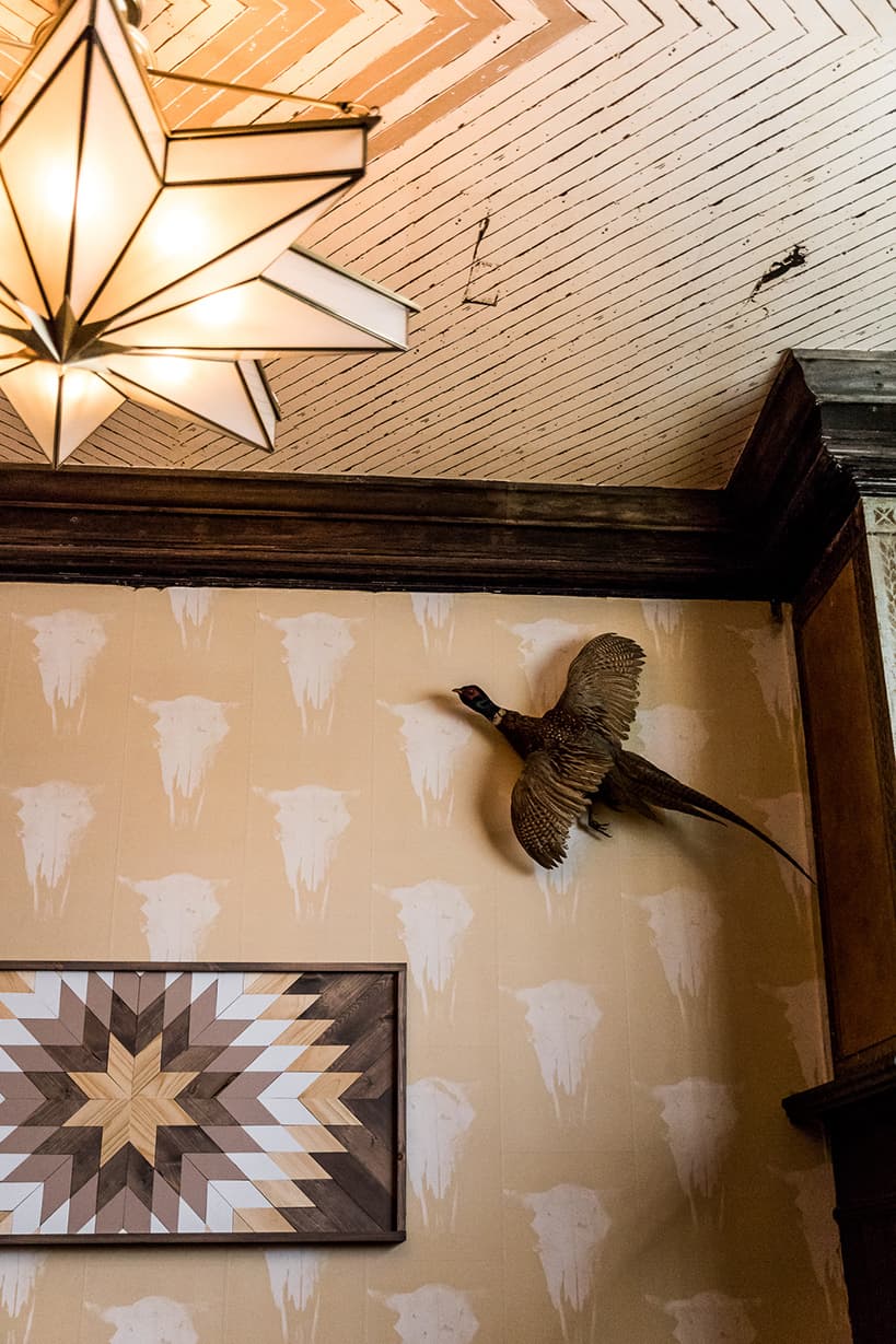
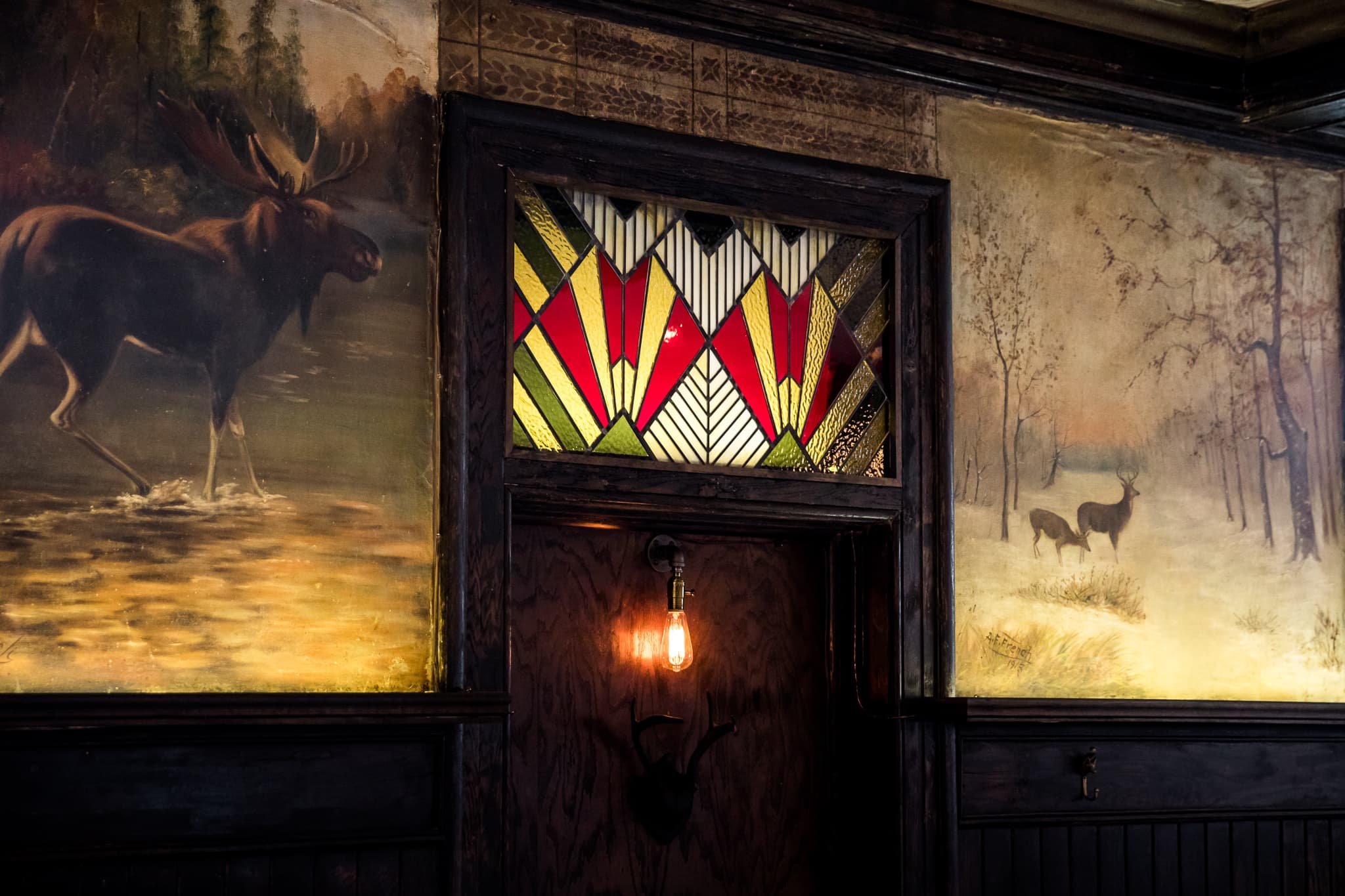
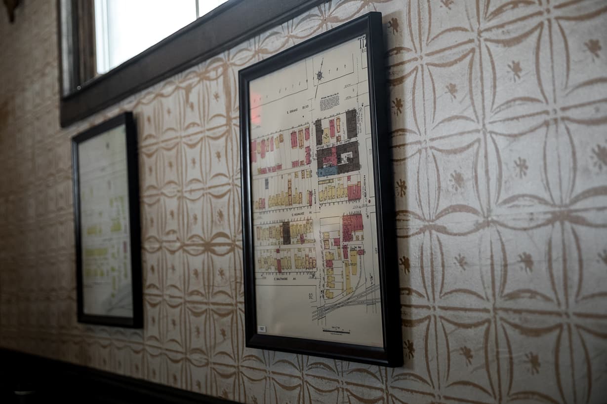
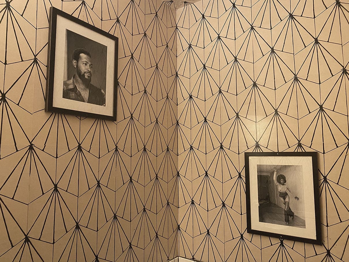
THE BRAND

All In The Name
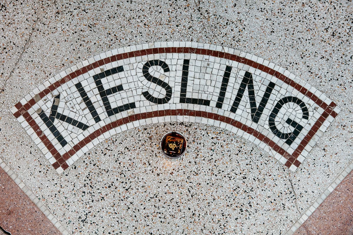
The building was constructed at the turn of the 20th century by a man named Kiesling and the front stoop bears his namesake, framed in terrazzo. We kept his name and the German references from the terrazzo lettering, combined with the forest references from the restored murals inside, and leaned into a combination of American Prairie and Art Deco patterns and colors to build the brand.
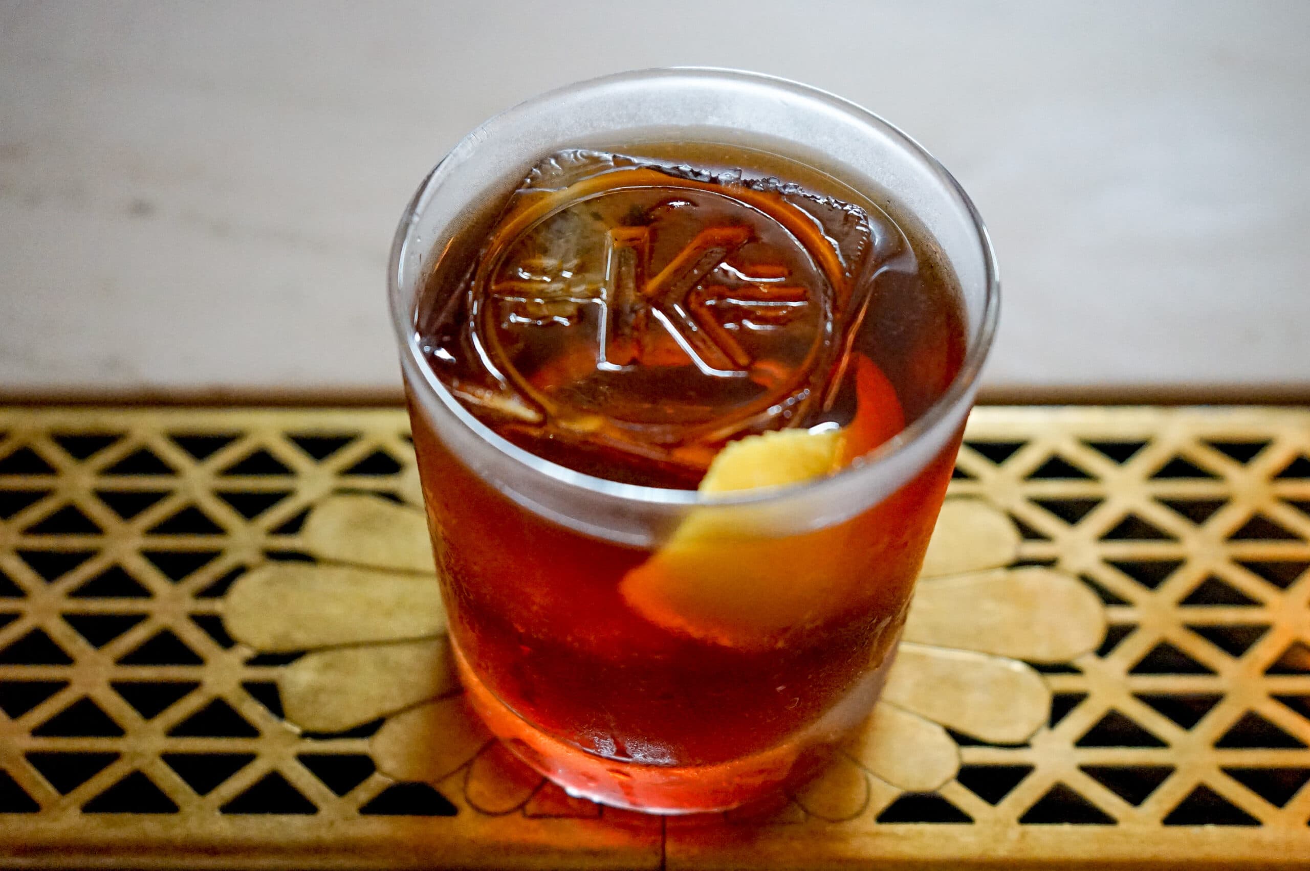
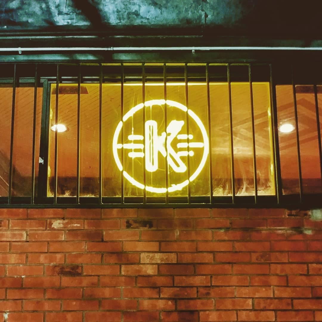
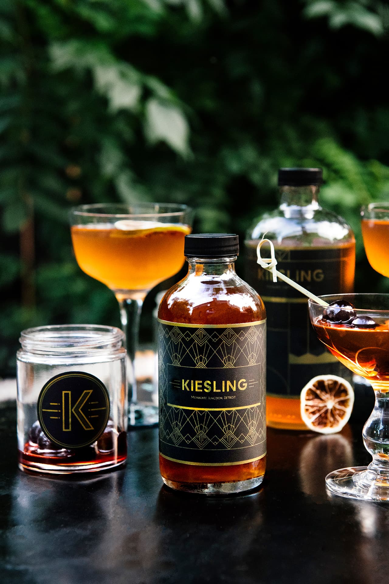
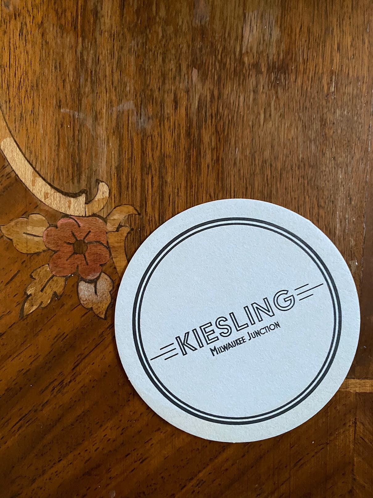
The brand identity features the Kiesling K and the buck head from the mural. Brand references are carried through at each customer touchpoint, from the front door and neon sign, to the coasters, the hand-painted wallpaper patterns, the to go bottle labels, the stamped ice cubes, and the menus.
The place exudes a warm glow at all times, and that's by design.




THE BRAND ONLINE
A Social Community
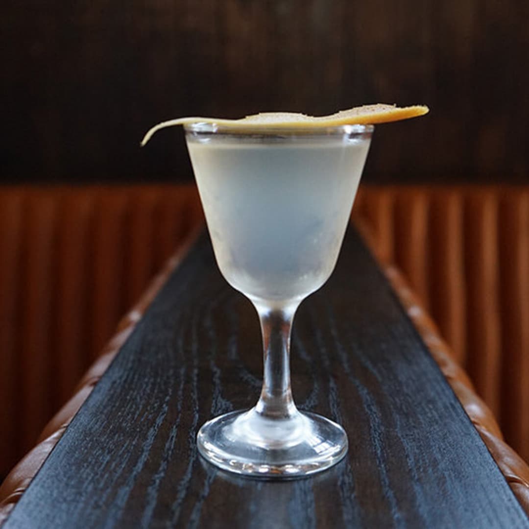
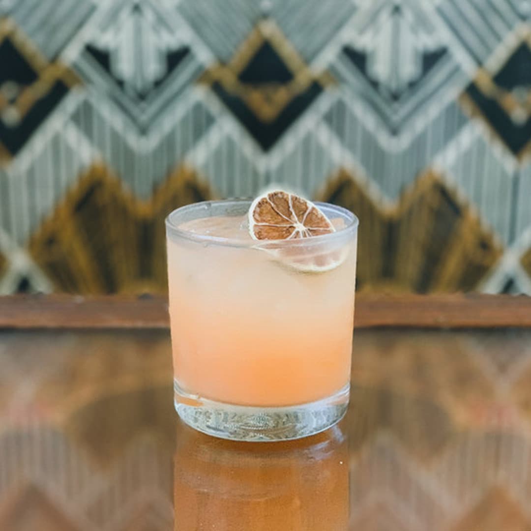
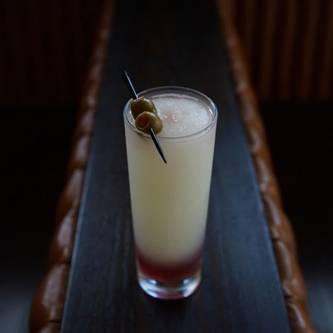
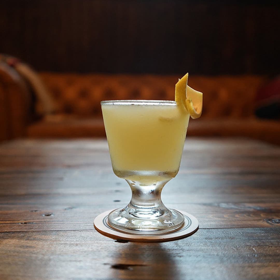
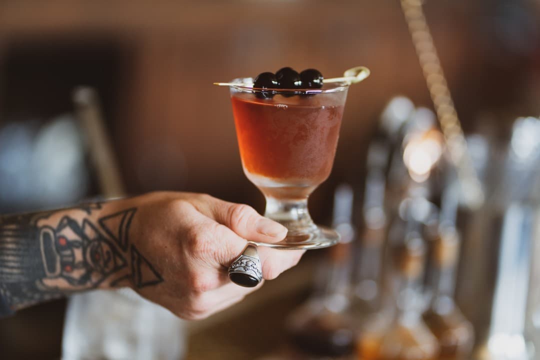
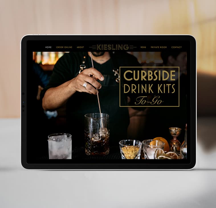
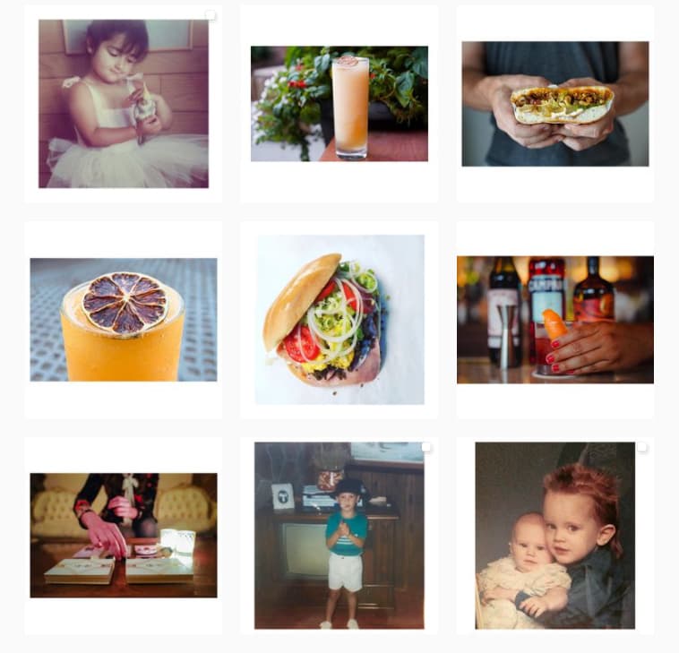
While the bar's website reflects the seasonal cocktail menus and high-low drink and food experiences (something for everyone!), the Instagram presence is full of beautiful cocktails crafted by the Kiesling staff and photographed by our team, accompanied by stories of each cocktail's origin. The account also contains background stories from each collaborator that participates in a monthly guest appearance behind the bar or in the kitchen, complete with a one-night-only menu. It's a place for foodies, drink connoisseurs, friends, and story-swappers alike!
THE RESULTS
Kiesling rapidly became Detroit's "industry bar" where folks from the hospitality industry commune with local artists, musicians, designers, layabouts and professionals alike, until the wee hours on the regular. The comfortable atmosphere and anti-pretentious vibes set this bar apart from other craft cocktail bars that might lack the approachability desired in a place that's intended to be a melting pot.
And on the design front, Citizen was honored to receive the Commerce Design Detroit Award for Kiesling in 2019, from the AIA and Design Core Detroit. But possibly the best compliment is that the bar is widely considered one of the most pleasant places to work among the local hospitality community. A great place to hang out, work, and meet your neighbors - mission accomplished!
THANK YOU
WALLPAPER ARTIST
Printsburgh
GOLDLEAF ARTIST
Motown Signs
ARCHITECT & DEVELOPER
Carlo Liburdi
STAINED GLASS ARTIST
Cantebury Glass
DRINK DIRECTOR
Rob Wilson
We’re always excited to meet new collaborators and potential clients!
Have something in mind?

NEWSLETTER
We love a good story. Sign up here to get a few in your inbox from time to time.


