CASE STUDY
INDUSTRY:
HOSPITALITY / COFFEE
PLACE:
A 250SF ABANDONED STOREFRONT IN THE HEART OF DETROIT'S MILWAUKEE JUNCTION NEIGHBORHOOD
SERVICES:
BRAND IDENTITY, PACKAGING, INTERIOR DESIGN, PRODUCT DESIGN, WEBSITE, SOCIAL CONTENT
THE CHALLENGE
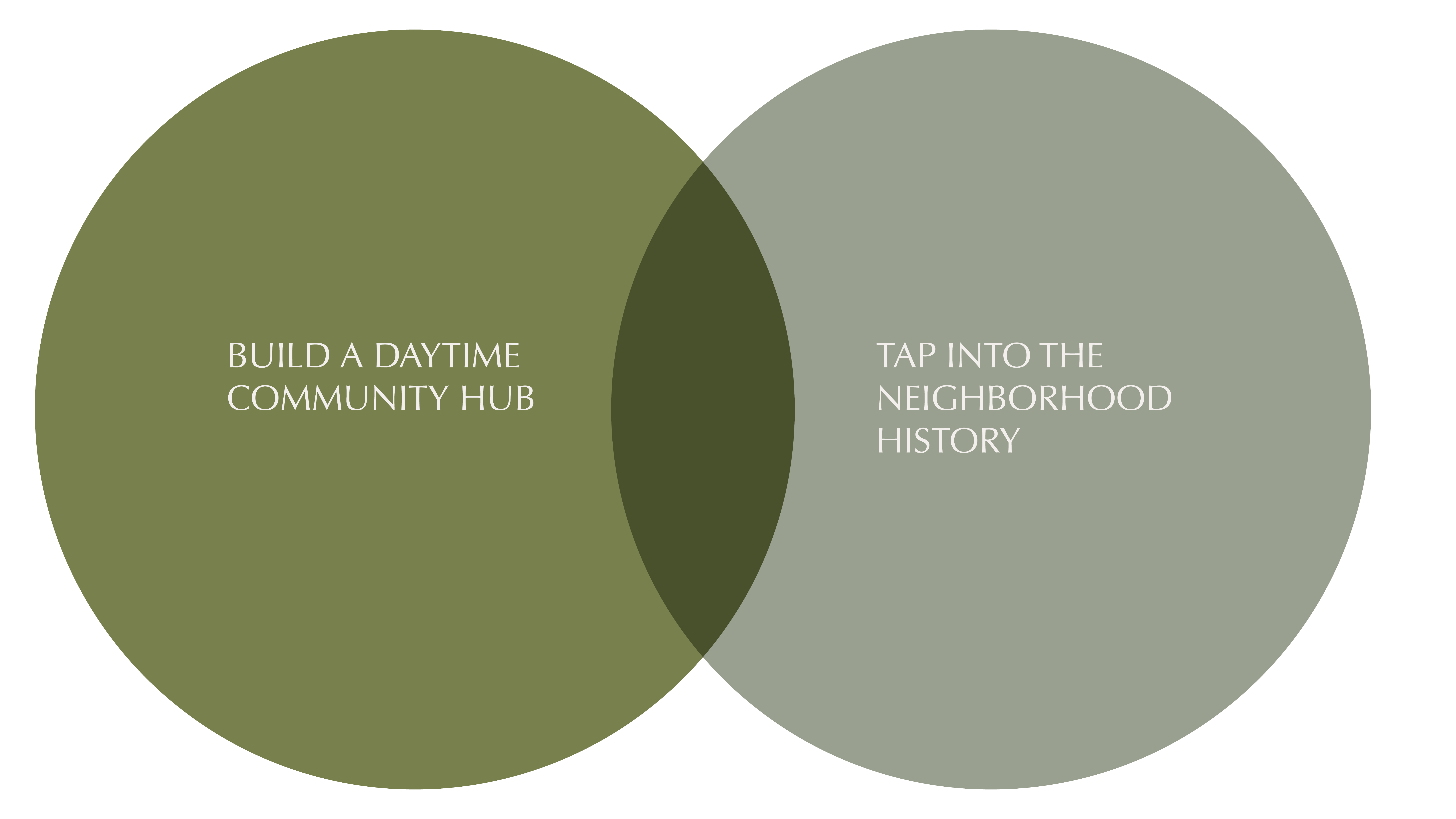
Waking Up The Neighborhood
We were tasked with creating a small retail experience that could bring life to a corner of Detroit that had been abandoned for decades. The neighborhood, Milwaukee Junction, is located just north of Midtown, in an area where the windows had been bricked over since the 80s. It had recently regained traction at night through the presence of a bar and some newly restored houses and apartments.
But during the day, there were no services for residents; no places to gather or meet. Actually, there were no signs of people at all. Yet the location was next to several major employers and a short walk from two major transportation corridors.
So we designed a coffee shop that could integrate into the day to day of the neighborhood - from the physical touchpoints of the retail space to the branding and website - like it had always been there.
“Coffee is a lot more than just a drink; it’s something happening.”
― Gertrude Stein, Selected Writings

THE BRAND IDENTITY
Setting The Tone
Milwaukee Caffè is a modern take on the classic espresso bar, where the brand says "Welcome back, friend." After decades of abandonment, we wanted to make sure that everything about the identity of the coffee shop expressed a new breath of life and the open arms of hospitality.
THE LOGO DESIGN
THE TYPE SYSTEM
A Tribute To "die Nachbarschaft"
We subtly pay homage to the neighborhood’s German roots through the Bauhaus-derived font pairing.
THE BRAND COLORS
Living Color Palette
The color palette reflects a feeling of abundant life through the range of natural greens and calming tones, highlighted by pink and gold.
BRINGING THE BRAND TO LIFE


We Love The Details
We obsess over them. Each touchpoint of Milwaukee Caffè - from the light fixture, to the marble dust in the plaster wall, to the finger grooves of the coffee cups and every inlay of the logo - each was designed to reinforce a brand experience that brings the community together in a place made just for them. The attention to detail is a demonstration of the attention the baristas have for providing an exceptional customer experience while also shining a light on the coffee communities that support them.
RETAIL DESIGN
For Humans, By Humans
We had 200sf to work with. TINY! So we blasted out the street wall, raised huge windows to create a sense of opening to the outside, and began to plan a design for a walk-up or drop-in kind of place that could feel like a little sanctuary to break up the day and bring all kinds of folks together. This would also be the first building in the neighborhood to open without bars on the windows, or obscured security glass, in decades. The message: you are safe and welcome here.


Setting The Stage
The retail space is one step above sidewalk level. This constraint, combined with our desire to make the shop visible and open to the street, led us to design the space with stage design principles in mind. The lighting puts the service area on display, while the backdrop is soft and considered as a frame for the menu and signage. We worked with the architect to frame the window ledge as a second counter, including a giant cantilevered window that can open to create more fluidity between interior and exterior, allowing customers to stand inside and out.

Take A Load Off
We also designed an outdoor seating space along the sidewalk, with benches around the trees, and bistro tables that can be moved to suit party sizes and social distancing.

A Welcoming Approach
We designed the bar as an organic, curved shape to avoid the “food stall” look that a tiny space can convey. The shape creates a soft barrier between the barista and customer, while providing increased customer space to stand at the bar.


Surface Materials & Design
We packed the interior with rich and diverse textures so that each square inch of the experience feels considered, and each patron feels well cared for as a result.
We worked with renowned plaster artist Lauren Dillon, who came up from South Carolina to help us install a Venetian Plaster wall in sage green. We also took the opportunity of having her in town to host a workshop for local artisans to learn traditional plaster work. (We had an awesome turnout of 20 students!)
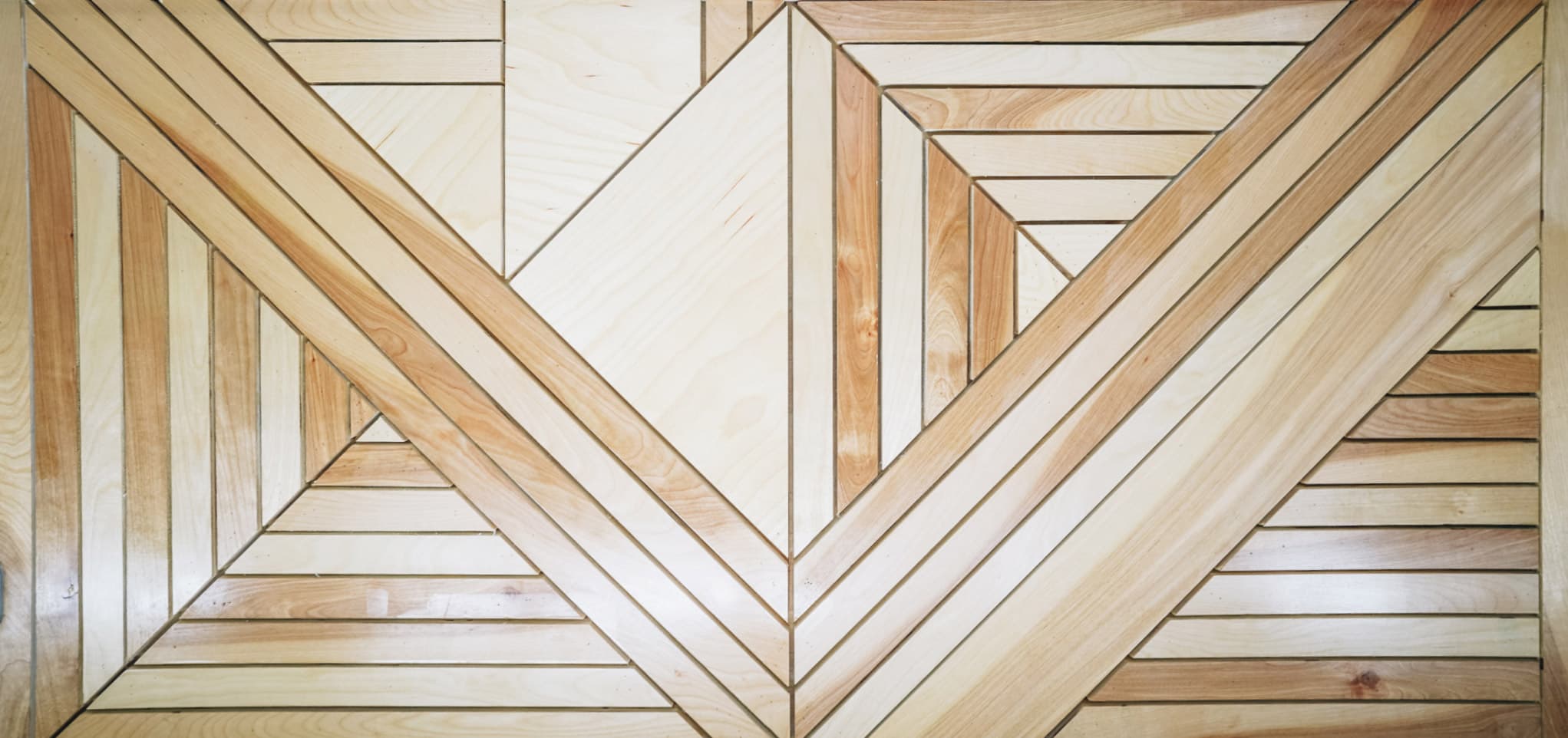
We covered any remaining drywall with panels and strips of wood that we designed to abstractly reflect the M in Milwaukee.


Cup Design
To enhance the customer experience, we worked with American ceramicist Mike Jabbur to develop a line of custom espresso cups, saucers, and larger mugs. They fit perfectly into the hand and invite customers to cozy up to the bar and stay for another.


THE BRAND ONLINE
Online Displays Of
Community
We took care in creating a website that reflects the staff values: it is a place to showcase the stories of other coffee companies - typically small roasters spread across North America from whom a rotation of beans will be served at Milwaukee Caffè. It’s also a place to tell stories about the community members who are making an impact, just like the physical place itself is for sharing stories! The social presence further amplifies these values with considered, human stories mixed with beautiful shots from the community.
THE BRAND COMMUNITY
Community Workshop
We worked with renowned plaster artist Lauren Dillon, who came up from South Carolina to help us install a Venetian Plaster wall in sage green. We also took the opportunity of having her in town to host a workshop for local artisans to learn traditional plaster work. (We had an awesome turnout of 20 students!)


THE RESULTS
Two weeks prior to opening in March 2020, the Covid-19 quarantine order came through. Final preparations had to be put on hold while we waited to see how the hospitality community might need to shift. Luckily, we’d added that giant cantilevered window to the facade, so customers could place orders from the sidewalk while baristas stay indoors. Milwaukee Caffè was able to open for curbside guests in June 2020. The response has been overwhelmingly positive. Although customers are still unable to come inside and stand at the bar, we have created a socially distanced outdoor area for people to await their coffees, sitting at small tables or at benches built around the tree planters. The best part is they can still chat with the baristas over the window ledge, and can experience a bit of the tiny interior because it’s right there at the street level.
In addition, within the first month we were able to grow an online community in the thousands through Instagram. We’ve begun to share stories about two other local coffee providers on the website and in social, and we’ve raised over $2500 for team-nominated organizations as a way to give back to the community. The branding has helped generate a daily surge of Instagram stories to keep word of mouth marketing up and ongoing marketing costs down. We can’t wait to see how the Milwaukee Caffe community evolves!


THANK YOU
CERAMICIST
Mike Jabbur
MASTER OF PLASTER
Lauren Dillon
COFFEE CAPTAIN & MANAGER
David Valdez
SIGN MAKER
Matt Tait
EQUIPMENT CONSULTATION
Anthology Coffee
DEVELOPER & CONTRACTOR
Terranovus
CHEERLEADERS
Detroit Hospitality Community
SPIRIT BOOSTERS
Milwaukee Junction Neighbors
We’re always excited to meet new collaborators and potential clients!
Have something in mind?

NEWSLETTER
We love a good story. Sign up here to get a few in your inbox from time to time.


